Airline Neutral: White Label Design System
UI design
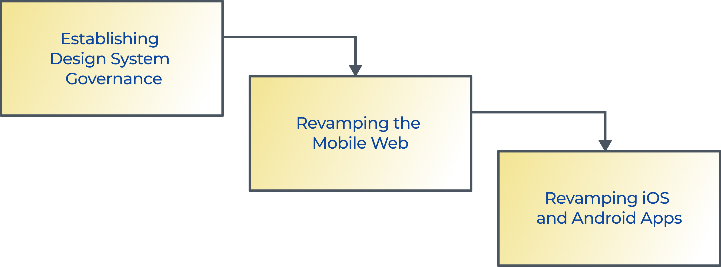
Strategy and Planning
UI Development
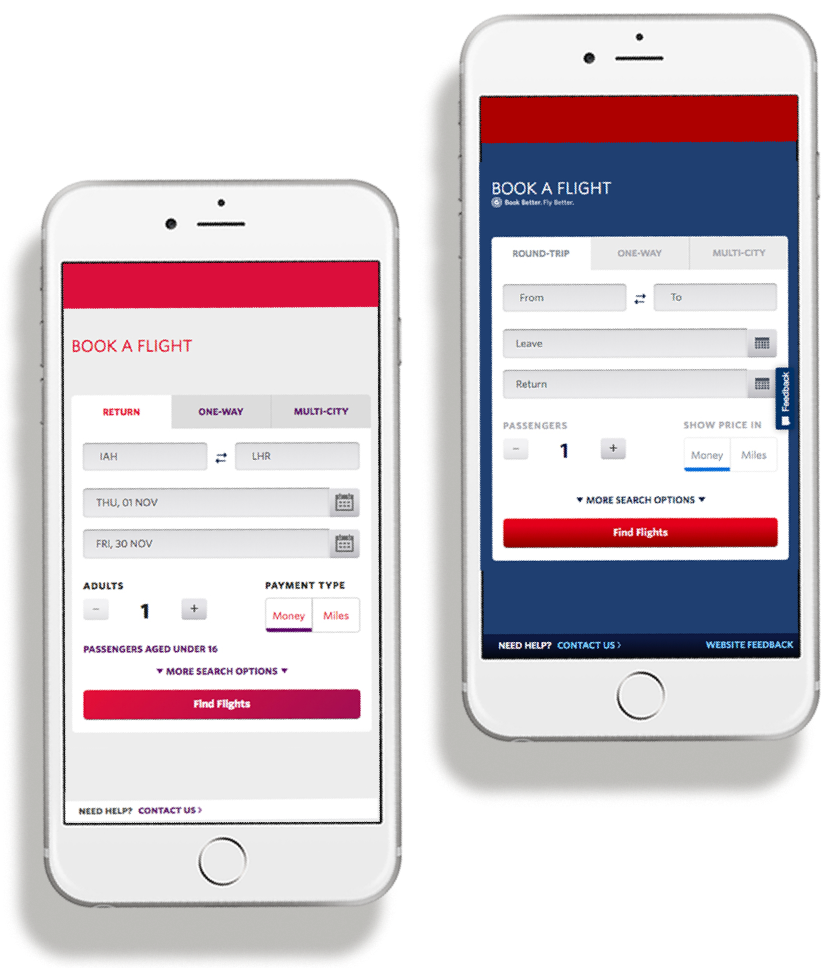
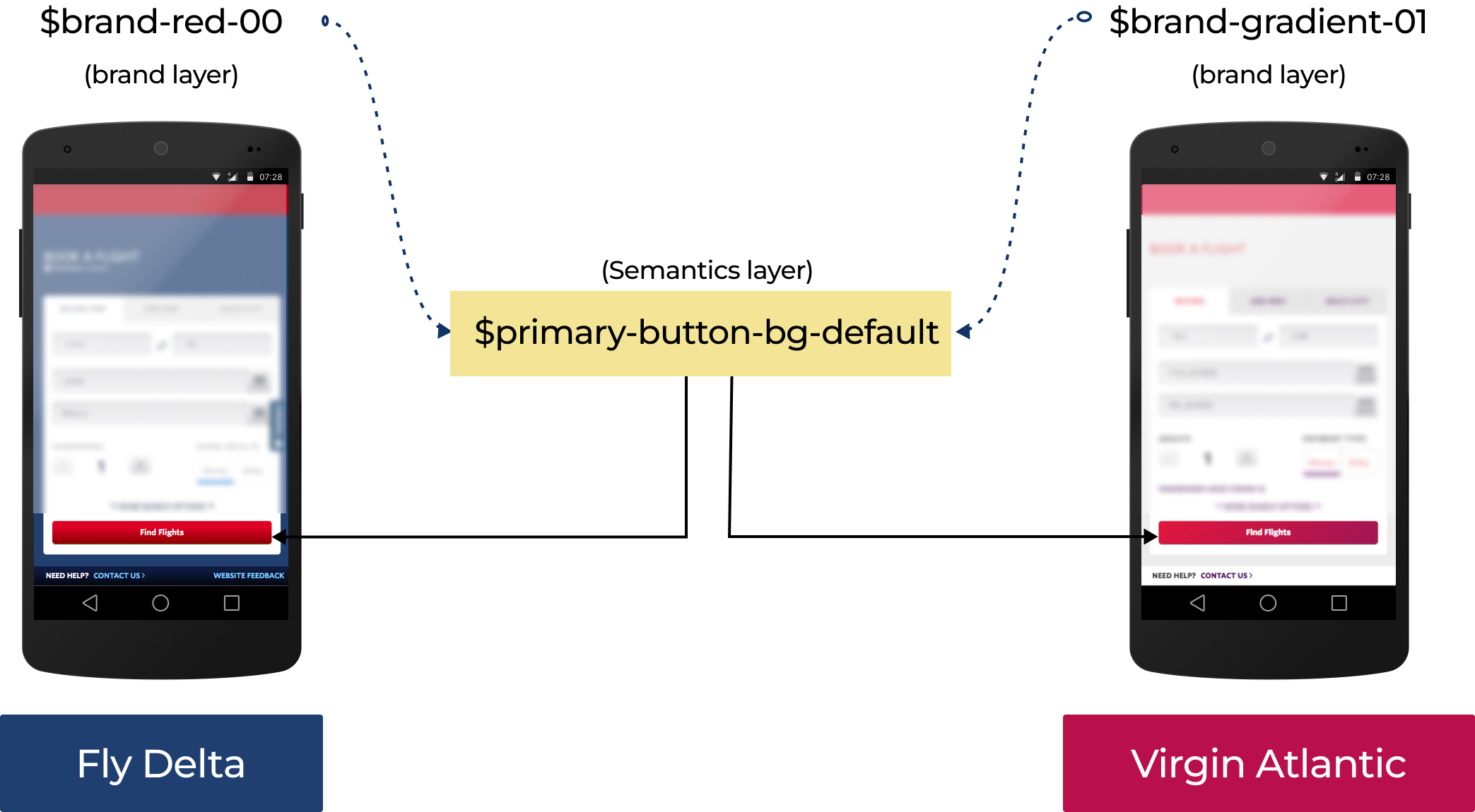
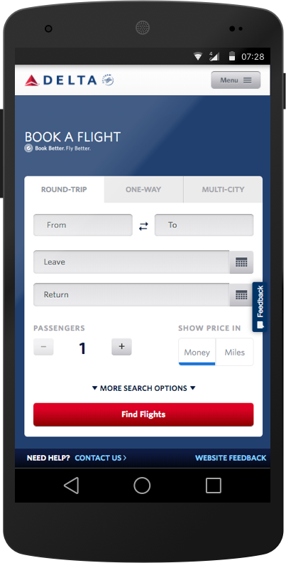
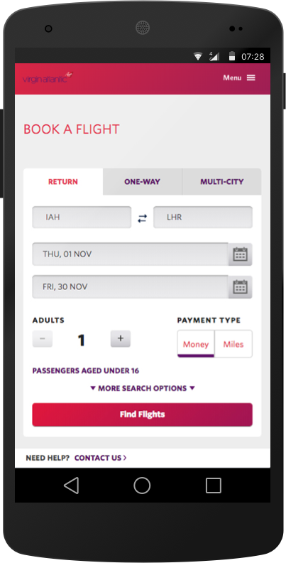
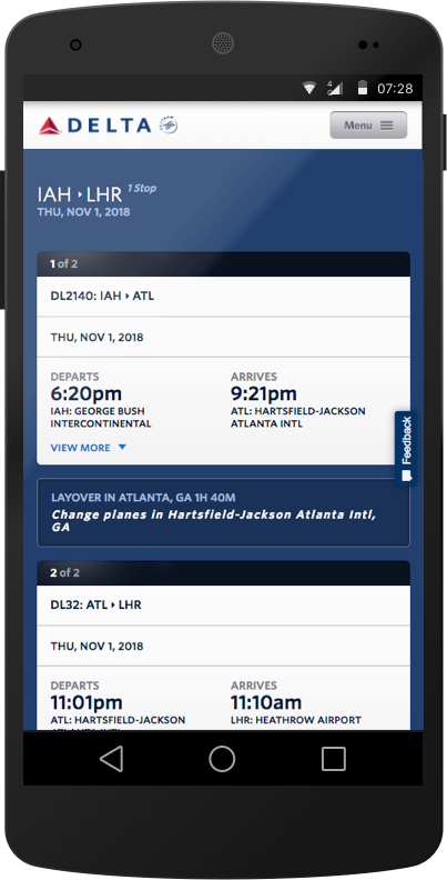
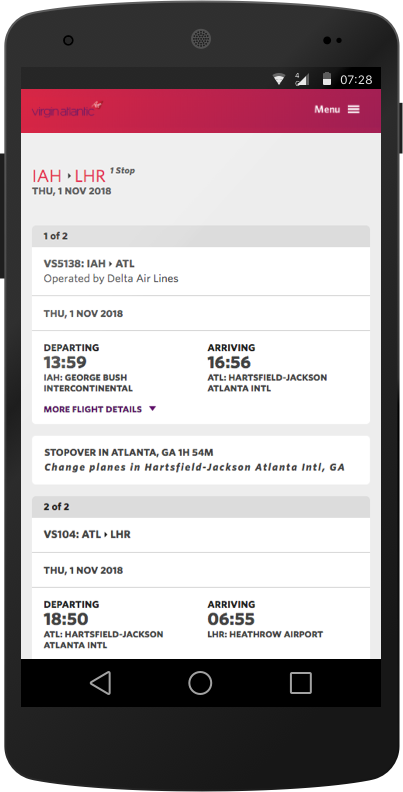
This project was built for Fly Delta Airlines and its newly acquired airlines, Virgin Atlantic Airlines, when I was working in Thoughtworks, in 2016.
We constructed mobile web interfaces as well as iOS and Android applications for Fly Delta Airlines. This initiative to create an airline-neutral solution enabled the Virgin Atlantic Airlines to transition to a new app by meticulously aligning with their unique brand directives.
Its adaptability extended to encompass diverse airlines, allowing their individual brand guidelines to be effortlessly integrated.