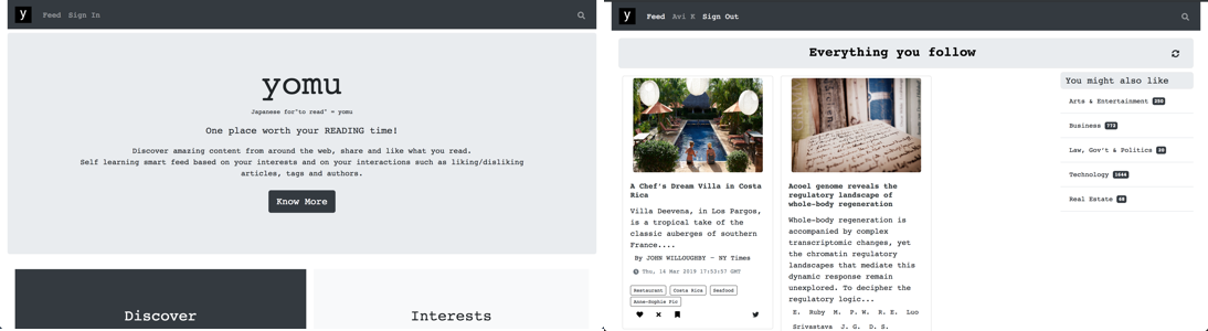
Yomu
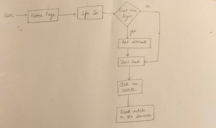
UX design
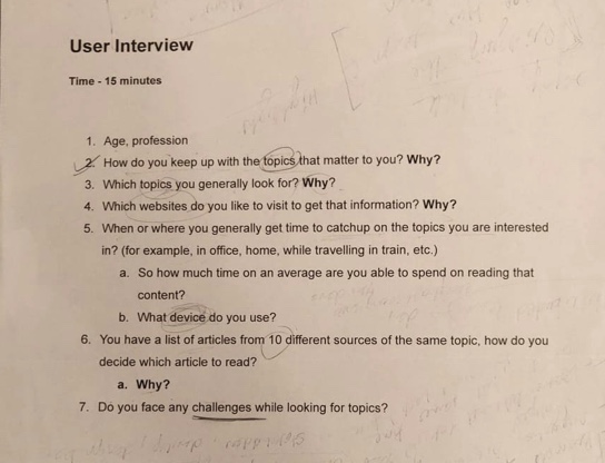
Research
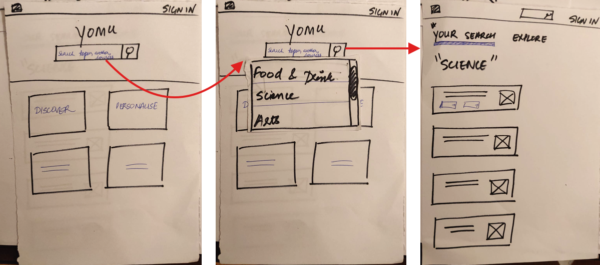
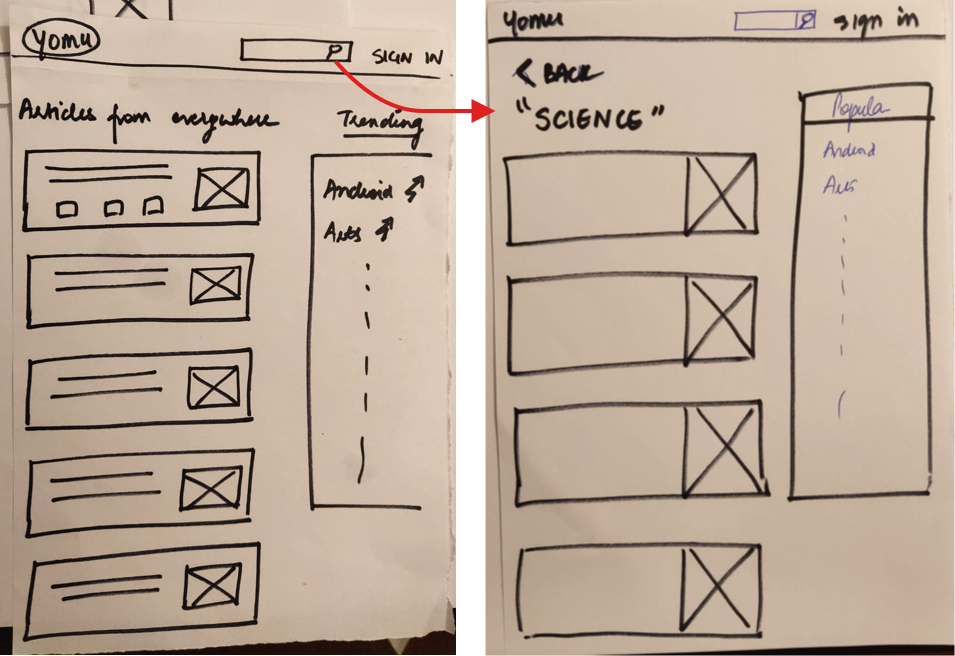
UI design
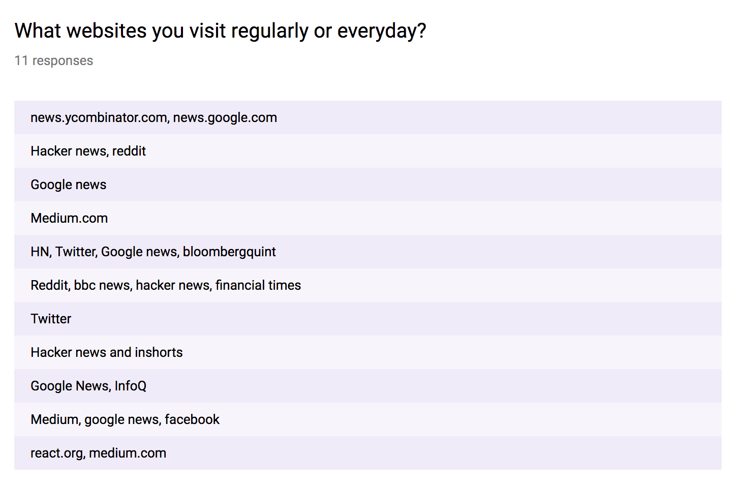
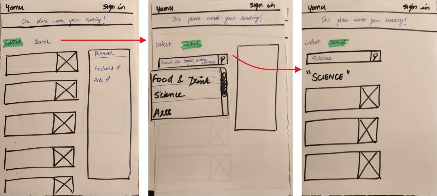
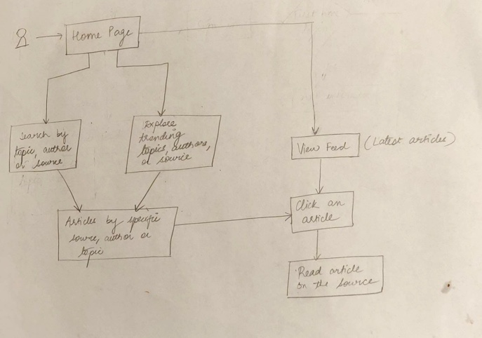
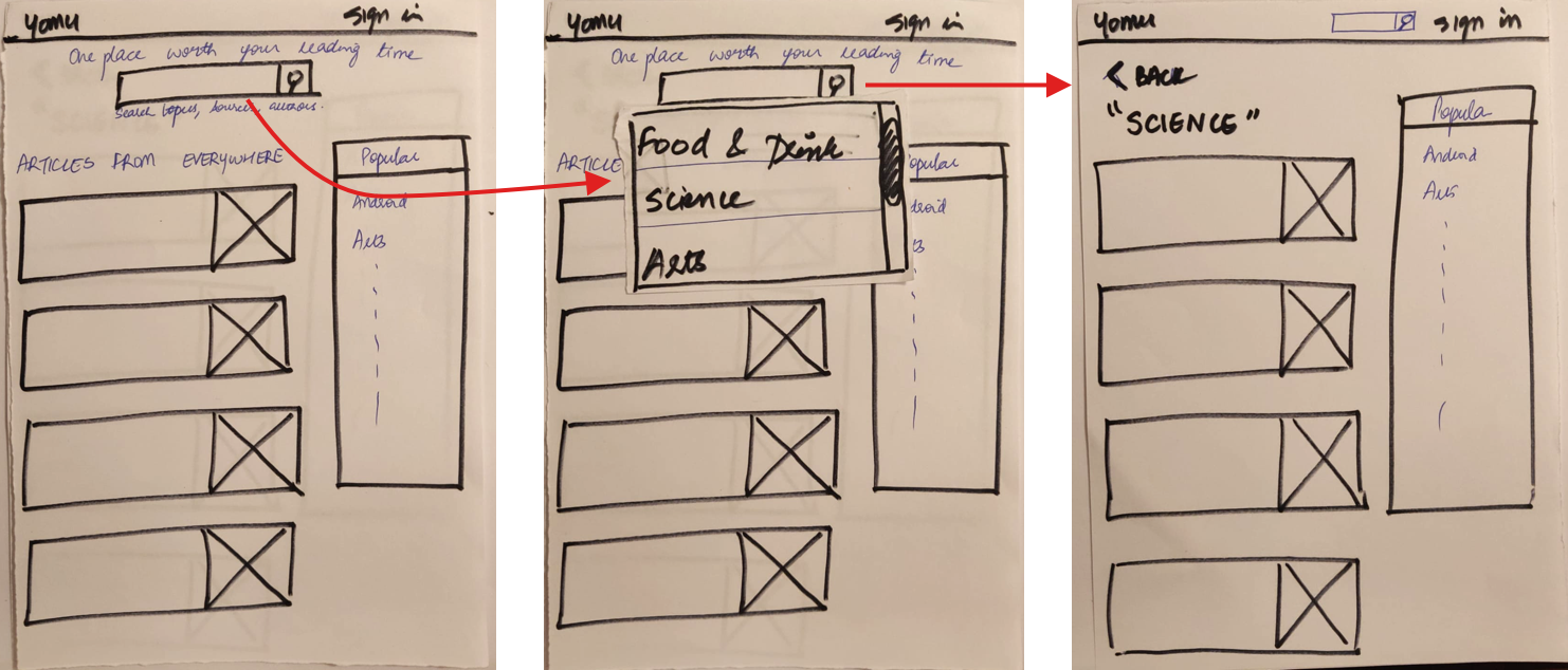
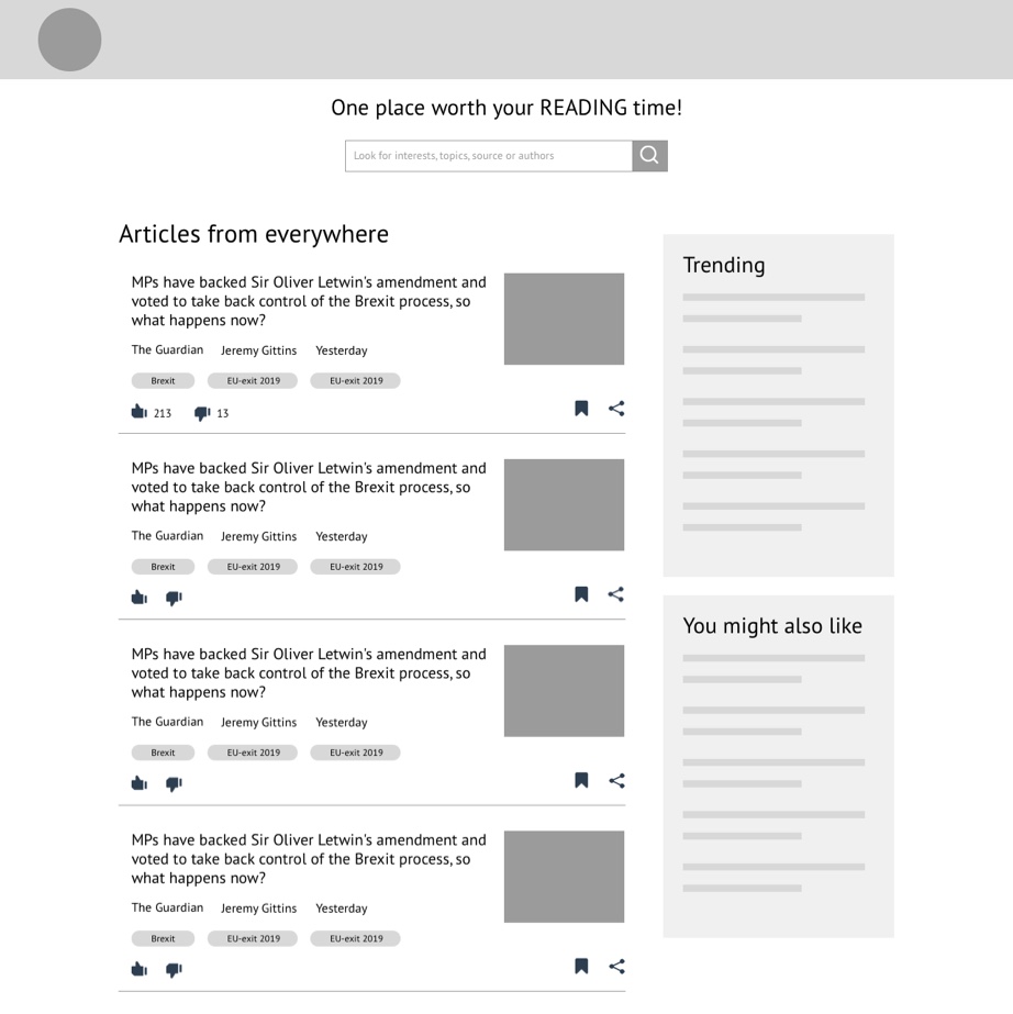
One-stop destination where users can find all the content from over 100's of sources based upon their interests, topics, authors or publishers.
This side project is being designed with the aim to sharpen my end-to-end skills in the design process.